Introduction
Data visualization is an important step in any data analysis process. In time series analysis, data visualization can help guide the testing, diagnostics, and estimation methods used. This tutorial provides an overview of how to plot time series data using the U.S. Wholesale Price Index data. In this tutorial, we will learn
- How to plot a data series on a time axis using the starting date and frequency.
- How to add a plot of first differences to your original graph.
Step 1: Load the data
For this example, we will use the U.S. WPI data which begins in 1960 and is collected each quarter.
// Load the variable 'ln_wpi' from the dataset
// 'wpi1.dat' located in your GAUSS working directory
y = loadd("wpi1.dat", "ln_wpi");loadd function to load the data from a stored dataset. You can learn more about loading data in the loading data tutorial series. Step 2: Create a default time series plot with plotTS
We can learn more about the way the WPI has evolved across time by plotting the natural log of the U.S. WPI index on the y-axis against the quarter it was collected. We will use the GAUSS plotTS function to draw the time series plot. plotTS has three required inputs
- dstart
- The date of the first observation.
- freq
- The frequency of the data. 1 - annual, 4 - quarterly, 12 - monthly.
- y
- The time series vector(s) to plot.
// Plot the data 'y', specifying that
// the data starts in January of 1960 and that
// the data is quarterly
plotTS(196001, 4, y);
The above code will produce a plot similar to the plot below.
Step 3: Customize the plot
While this graph does show us the data, we would like to give the graph a title, label the Y-axis and change the format of the X-axis tick labels. To accomplish these goals, we will create a plotControl structure to hold our plot settings and use the plotSet functions to modify the settings held in the plotControl structure.
// Declare 'myPlot' to be a plotControl structure
// and fill with default settings for XY plots
struct plotControl myPlot;
myplot = plotGetDefaults("XY");

// Turn off grid
plotSetGrid(&myPlot, "off");

// Set the title text, font and font-size
plotSetTitle(&myPlot, "U.S. Wholesale Price Index ", "Helvetica Neue", 18);

// Set the Y-axis text, font and font-size
plotSetYLabel(&myPlot, "ln(wpi)", "Helvetica Neue", 14);

// Set the X-tick label format to 4 digit year
plotSetXTicLabel(&myPlot, "YYYY");

// Place an X-tick every 5 years (20 quarters),
// starting with January of 1960
plotSetXTicInterval(&myPlot, 20, 196001);

// Draw the plot, using the settings
// in 'myPlot'
plotTS(myPlot, 196001, 4, y);
In this plot, we see that the WPI series shows a fairly stable increase over time. This suggests that the data may not be mean reverting and should be subjected to unit root testing.
Step 4: Add a graph of the first differences
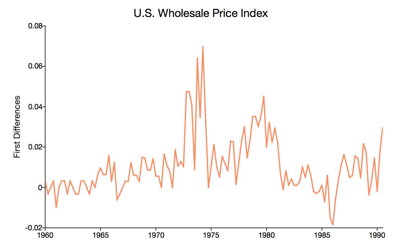
Visualizing the first differences alongside the level data will provide some insight into the potential benefits of transforming our data.
We will difference the data with the vmdiffmt function from the GAUSS time series package, TSMT.
// Make the time series functions available
library tsmt;

// Calculate the first difference
y_diff = vmdiffmt(y, 1);
We can use the plotControl structure created above and just modify the Y-label.
// Change the Y-label text, but keep the
// previously set font and font-size
plotSetYlabel(&myPlot, "First Differences");

// Plot the first differences
plotTS(myPlot, 196004, 4, y_diff);
The added plot of the first differences shows that the new series is centered around zero. This suggests that the first differences are mean reverting and may be a more appropriate series for estimation.
Conclusion
Time series graphs give us valuable insight into the behavior of time series data. Visualizing time series data provides a preliminary tool for detecting if your data:
- Is mean-reverting.
- Demonstrates structural breaks.
- Has a time trend, and other important time series characteristics.
Now that you have graphed your time series data you can make more informed decisions about what steps to take next.
Extra Credit: Combine the time series and first differences plot
Below is the full code to create the graph at the top of this tutorial which combines the original time series and the first differences into a stacked series.
// Make the time series functions available
library tsmt;

// Load the variable 'ln_wpi' from the dataset
// 'wpi1.dat' located in your GAUSS working directory
y = loadd("wpi1.dat", "ln_wpi");

// Declare 'myPlot' to be a plotControl structure
// and fill with default settings for XY plots
struct plotControl myPlot;
myplot = plotGetDefaults("XY");

// Turn off grid
plotSetGrid(&myPlot, "off");

// Set the title text, font and font-size
plotSetTitle(&myPlot, "U.S. Wholesale Price Index ", "Helvetica Neue", 18);

// Set the Y-axis text, font and font-size
plotSetYLabel(&myPlot, "ln(wpi)", "Helvetica Neue", 14);

// Set the X-tick label format to 4 digit year
plotSetXTicLabel(&myPlot, "YYYY");

// Place an X-tick every 5 years (20 quarters),
// starting with January of 1960
plotSetXTicInterval(&myPlot, 20, 196001);

// Set the axes lines to be black and 1 pixel thick
plotSetAxesPen(&myPlot, 1, "black");

// Divide the plot canvas into a 2x1
// grid and place the next plot
// into the first cell
plotLayout(2, 1, 1);

// Draw the plot, using the settings
// in 'myPlot'
plotTS(myPlot, 196001, 4, y);

// Compute the first differences
y_diff = vmdiffmt(y, 1);

// Change the Y-label text, but keep the
// previously set font and font-size
plotSetYlabel(&myPlot, "First Differences");

// Turn off the title for the second plot
plotSetTitle(&myPlot, "");

// Divide the plot canvas into a 2x1
// grid and place the next plot
// into the first cell
plotLayout(2, 1, 2);

// Draw the plot of the first differences
// Notice they start one period ahead
plotTS(myPlot, 196004, 4, y_diff);

// Restore the plot layout to the
// default setting for individual plots
plotClearLayout();


