Introduction
GAUSS provides functions to make it simple to create time series plots. In this tutorial, we will plot a short section of data from the file tbill_3mo.xlsx. This data file can be found in the GAUSS examples directory, starting in GAUSS version 16. If you do not have the file, you can download the file here.
Load the data
Our first step will be to load a portion of the data from this time series. Make sure that the data file, tbill_3mo.xlsx is in your GAUSS working directory and then load the first two years of data with this command:
//Load 24 monthly observations tbill = xlsReadM("tbill_3mo.xlsx", "B2:B25");
Now the variable, tbill, should contain 24 separate observations. These observations are monthly and the first observation is from January of 1982.
Plot the time series
The GAUSS function plotTS creates time series plots. It takes the following inputs:
- myPlot
- Optional input, instance of a plotControl structure, containing desired plot attributes.
- dstart
- Scalar, the first date of the time series. Either a four-digit year, 1982, or a 4 digit year followed by a two-digit month, 198201.
- freq
- Scalar, the frequency of the data per year. Valid inputs include: 1 annual data, 4 quarterly data, 12 monthly data
- y
- NxK matrix containing one or more time series to plot.
Let's draw a basic time series plot of our tbill data from above:
//First data in series is January 1982 //dstart = 198201 would also work dstart = 1982; //Data is monthly, or 12 times per year freq = 12; //Create basic time series plot plotTS(dstart, freq, tbill);
After running the above code, you should see a plot that looks similar to this:
Customize
Now we will customize this plot. If you are not familiar with the GAUSS plotControl structure, or the GAUSS plotSet functions, read through this tutorial to learn how easy they are to use.
Tick label frequency
Let's start our customization by controlling the frequency and location of the tick labels. The plotSetXTicInterval function will allow us to accomplish this task. plotSetXTicInterval takes the following inputs:
| &myPlot | A pointer to a `plotControl` structure, containing the settings for your plot. |
| ticInterval | Scalar, the number of time periods between tick labels. |
| firstLabeled | Optional input, the first time period on which a label should be placed. |
//Declare 'myPlot' to be a plotControl structure struct plotControl myPlot; //Fill 'myPlot' with default values for 'xy' plots //time series plots use 'xy' settings myPlot = plotGetDefaults("xy"); //Draw the tick labels every 3 months //Draw the first label at April of 1982 plotSetXTicInterval(&myPlot, 3, 198204); //Draw graph using plotControl structure plotTS(myPlot, 1982, 12, tbill);
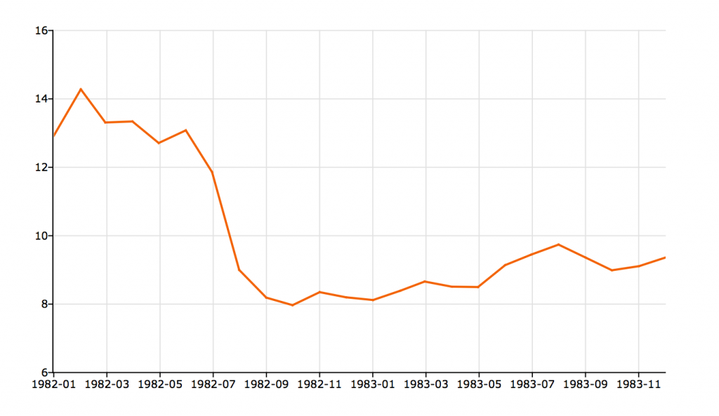
This time, our graph should look like this:
As we expect, the first tick label is placed at the fourth month of 1982 and we see one tick label every three months.
Tick label format
Since our tick labels are placed at the start of quarters, we might want to change the tick label format to show the quarter rather than the month. We can do this with plotSetXTicLabel, which takes the following inputs:
| &myPlot | A pointer to a `plotControl` structure, containing the settings for your plot. | ||||||||
| fmt | String, a `dttostr` date format specifier. For example, July of 1982 could be represented as:
| ||||||||
| labelAngle | Optional input, the angle at which to print the tick label. |
//Change the tick label format to show quarters plotSetXTicLabel(&myPlot, "YYYY-QQ"); //Redraw the time series plot plotTS(myPlot, 1982, 12, tbill);
After the above code, the updated plot will look like this:
Put it all together
The following code reproduces all settings in this tutorial and also shows how to: set the range of the Y-axis, add a title, add a label to the Y-axis and turn off the background grid:
new; //Load 24 monthly observations tbill = xlsReadM("tbill_3mo.xlsx", "B2:B25"); //First data in series is January 1982 //dstart = 198201 would also work dstart = 1982; //Data is monthly, or 12 times per year freq = 12; //Declare 'myPlot' to be a plotControl structure struct plotControl myPlot; //Fill 'myPlot' with default values for 'xy' plots //time series plots use 'xy' settings myPlot = plotGetDefaults("xy"); //Draw the tick labels every 3 months //Draw the first label at April of 1982 plotSetXTicInterval(&myPlot, 3, 198204); //Change the tick label format to show quarters plotSetXTicLabel(&myPlot, "YYYY-QQ"); //Add title plotSetTitle(&myPlot, "US 3 month tbill rates", "Arial", 16); //Set Y-label plotSetYLabel(&myPlot, "Percent"); //Set range of Y-axis from 0 to 16 plotSetYRange(&myPlot, 0, 16); //Turn off background grid plotSetGrid(&myPlot, "off"); //Redraw the time series plot plotTS(myPlot, dstart, freq, tbill);


